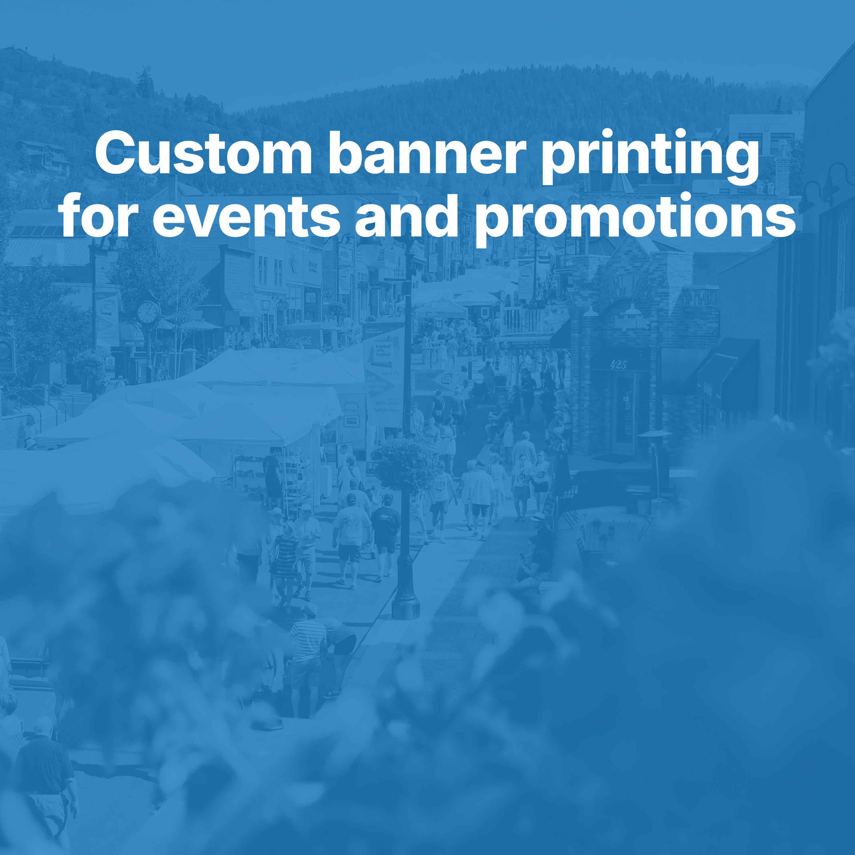
Outdoor event banners have a practical job.
They need to hold attention in an environment that is rarely calm or controlled. Wind changes how the banner hangs. Sun changes contrast. Rain can affect materials and visibility. Vehicle and foot traffic shorten the amount of time people have to read. At the same time, the banner still has to represent the event or business well.
That is why outdoor event banner design is less about decoration and more about real world performance.
A banner that looks good on a laptop screen can fail quickly outdoors if the text is too small, the message is too long, or the material is not suited for the conditions. The banners that perform best are usually the ones designed around the environment first.
Distance Should Shape the Message
The first question for an outdoor banner is not what color to use. It is how far away people will be when they first see it.
A banner viewed from across a street needs a different message structure than one seen while standing in a registration line. A roadside event banner should usually communicate in very few words. A banner near an entrance can support more detail because people have more time to absorb it.
This matters because distance affects almost every design decision:
- headline length
- type size
- logo scale
- amount of secondary information
- image use
If viewers need to read the banner from a distance, the layout should focus on one dominant idea. That might be the event name, date, headline, sponsor, or location cue. Supporting details should only stay if they can still be processed quickly.
A simple rule tends to hold up well. The farther away people are, the fewer words the banner should carry.
Outdoor Banners Need to Be Read in Motion
Not every viewer is standing still.
Many outdoor banners are noticed from passing cars, from sidewalks with steady foot traffic, or from crowded event grounds where people are dividing attention between multiple things. That means the design must work under motion, not just under ideal viewing conditions.
In motion, people do not read line by line. They scan for signals.
Those signals often include:
- a strong headline
- a recognizable event or business name
- a clear date or offer
- simple directional language
- a visual cue that tells them what kind of event or promotion this is
This is why long descriptive copy usually underperforms outdoors. Even when the information is useful, the environment may not allow people enough time to read and retain it.
Weather Is Part of the Design Problem
Weather does not just affect durability. It affects visibility.
Bright sunlight can wash out weak color combinations. Wind can cause a banner to move in ways that make thin typography harder to read. Rain can reduce contrast and change how surfaces appear from a distance. Overcast conditions can mute colors that seemed strong during proofing.
Because of that, outdoor banner design works best when contrast and simplicity are built in from the start.
Useful design choices often include:
- high contrast between text and background
- strong, readable typefaces
- limited color palettes
- layouts that do not rely on small detail
- messaging that remains clear even if conditions are less than ideal
Material choices matter too. A heavy duty outdoor banner is usually a better fit for events exposed to changing conditions than a product chosen only for convenience.
At Print Fellas, the advantage is not just that customers can order banners. Real designers can customize the design to fit the event, brand, and message while the product itself is selected for how it will actually be used outdoors.
Traffic Patterns Change What Works
Traffic is not only about how many people pass by. It is about where they are coming from and how quickly they move through the space.
A banner placed near a parking lot entrance may need to confirm arrival and direct people fast. A banner facing street traffic may need to be more like a billboard, with very few words and strong recognition. A banner near a stage or community booth may need to reinforce branding because people are already close enough to engage.
Thinking about traffic patterns helps businesses answer questions like:
- Will people see this head on or from an angle?
- Will they be walking, driving, or waiting?
- How much time will they realistically have?
- What should they understand first?
Those answers influence layout more than trend based design advice ever will.
Strong Banner Hierarchy Makes Fast Reading Possible
Outdoor banners need hierarchy that works instantly.
A viewer should be able to identify the main message without effort. If everything is emphasized, nothing is emphasized.
A practical hierarchy for many outdoor event banners looks like this:
- headline or event name
- primary supporting detail such as date, location, or offer
- sponsor or business identity
- optional call to action
That order can shift depending on the goal. For a sponsored event, the organizer may want event recognition first. For a promotion, the offer may need to dominate. For a recurring local event, the location and timing may matter most.
Custom design is useful because the hierarchy can be built around the real objective instead of inherited from a generic template.
Images Should Support Recognition, Not Compete With It
Images can help an outdoor banner feel more specific and engaging, but only when they support readability.
Crowded photographic backgrounds often make banners harder to read outdoors. So do images that pull attention away from the main message without clarifying it. In many cases, a cleaner background and stronger typography outperform a busier concept.
If images are used, they usually work best when they:
- reinforce the event type or mood
- stay secondary to the main message
- preserve contrast around text
- remain visually simple at full size
The banner still has to communicate in seconds. If the image makes that harder, it is not helping.
Durability Sends a Brand Signal Too
People notice quality even when they are not consciously evaluating materials.
A banner that sags, curls, tears easily, or looks weak in the setting can affect how the event or business is perceived. Outdoor signage is public facing, so physical durability becomes part of the brand impression.
That is especially true for:
- grand openings
- street promotions
- community events
- sponsor banners
- outdoor concerts
- school or nonprofit events
For a closer look at how signage shapes event perception, see our guide on event signage for local businesses. And if your event also needs posters, combining both formats usually creates stronger visibility.
A heavy duty banner with proper finishing can look more reliable, stay cleaner through the event, and hold up better if it needs to be reused.
Calls to Action Need to Match the Setting
An outdoor banner does not always need a strong sales pitch, but it should give interested people a clear next step when appropriate.
Depending on the event, that next step could be:
- visit the gallery for ideas
- request a quote
- upload artwork for a custom banner or sign
- view the event banner product page
- follow up with the business after the event
The best call to action is the one that fits the audience's level of interest. A quick quote request may make sense for businesses planning their own event displays. A gallery may be more useful for someone still exploring styles and formats. An upload option works well when the customer already has artwork and wants to move into production.
Good Outdoor Banners Are Designed for Their Exact Job
This is where many businesses gain the most from working with a print partner that offers more than simple online ordering.
Outdoor event banners are not interchangeable. A school fundraiser banner, a sponsor banner for a public event, a grand opening banner, and a concert promotion banner all have different goals even if the product type is technically the same.
Print Fellas stands out because real designers can customize the design to fit the event, brand, and message. That helps customers avoid the common problem of forcing important outdoor signage into a template that was not built for the actual situation.
When the design reflects the specific setting, the banner usually reads better, feels more intentional, and performs more effectively.
A Better Banner Starts With a Few Practical Questions
Before ordering an outdoor event banner, it helps to think through a short checklist:
- Where will it be installed?
- How far away will viewers be?
- Will people see it while moving?
- What weather conditions matter most?
- What is the main message?
- What should viewers do next?
Those answers usually lead to better outcomes than starting with style alone.
If you are planning an outdoor event banner, it can help to browse the Print Fellas gallery for examples, request a quote for a custom project, or upload artwork if your concept is already developed. Product pages for banners and related event signage like posters can also help clarify the right format for the space.
Outdoor banners are most effective when they are designed for the real conditions they will face, not the ideal conditions imagined during ordering. Distance, weather, and traffic all shape performance. When the design accounts for those factors from the start, the banner has a much better chance of being seen, understood, and remembered.