Event posters often look simple from a distance, but the ones that work well usually solve several problems at once.
They have to attract attention, communicate quickly, fit the tone of the event, and stay readable in whatever environment they are placed. A poster for a concert has different needs than a poster for a sidewalk promotion or a public community event, but the strongest posters across all three categories share the same basic strength. They make the message easy to notice and easy to understand.
That sounds straightforward, but it is where many posters struggle.
Some posters try to carry too much information. Others look visually interesting but hide the most important details. Some depend too heavily on templates that do not reflect the actual event or audience. The result is a poster that may be attractive in theory but less effective in practice.
Effective Posters Usually Prioritize One Clear Idea
A poster does not need to communicate everything a flyer, event page, or website can communicate.
Its first job is to make the event or promotion feel recognizable. That usually means leading with one clear idea.
For a concert poster, that may be the performer or event name.
For a promotional poster, it may be the offer.
For a public event, it may be the event title and date.
Once the main idea is easy to grasp, other details can support it. If several ideas compete at the same level, the poster often becomes harder to scan and easier to ignore.
Hierarchy Determines How Fast the Poster Works
People engage with posters in layers.
They notice the largest and highest contrast element first. Then they process secondary details. Finally, if the poster has earned their attention, they read the smaller information.
That makes hierarchy one of the most important parts of poster effectiveness.
A poster with strong hierarchy often includes:
- one dominant headline
- one clear layer of supporting details
- readable secondary information
- brand elements that support the message without interrupting it
This structure helps the poster work in real spaces where people are moving quickly or scanning several signs at once.
Concert Posters Need Energy, But Still Need Clarity
Concert posters often have more visual personality than other event posters, which makes sense. Music events benefit from mood, character, and a sense of anticipation.
Still, clarity matters just as much as style.
A concert poster should make the main act, event name, or date easy to find. If the design atmosphere overwhelms the event information, the poster may feel expressive but fail as a communication tool.
The strongest concert posters usually balance:
- a clear focal point
- typography that matches the event tone
- date and venue information that stays easy to spot
- imagery or graphics that enhance the identity of the event
That balance helps the poster feel distinctive without becoming confusing.
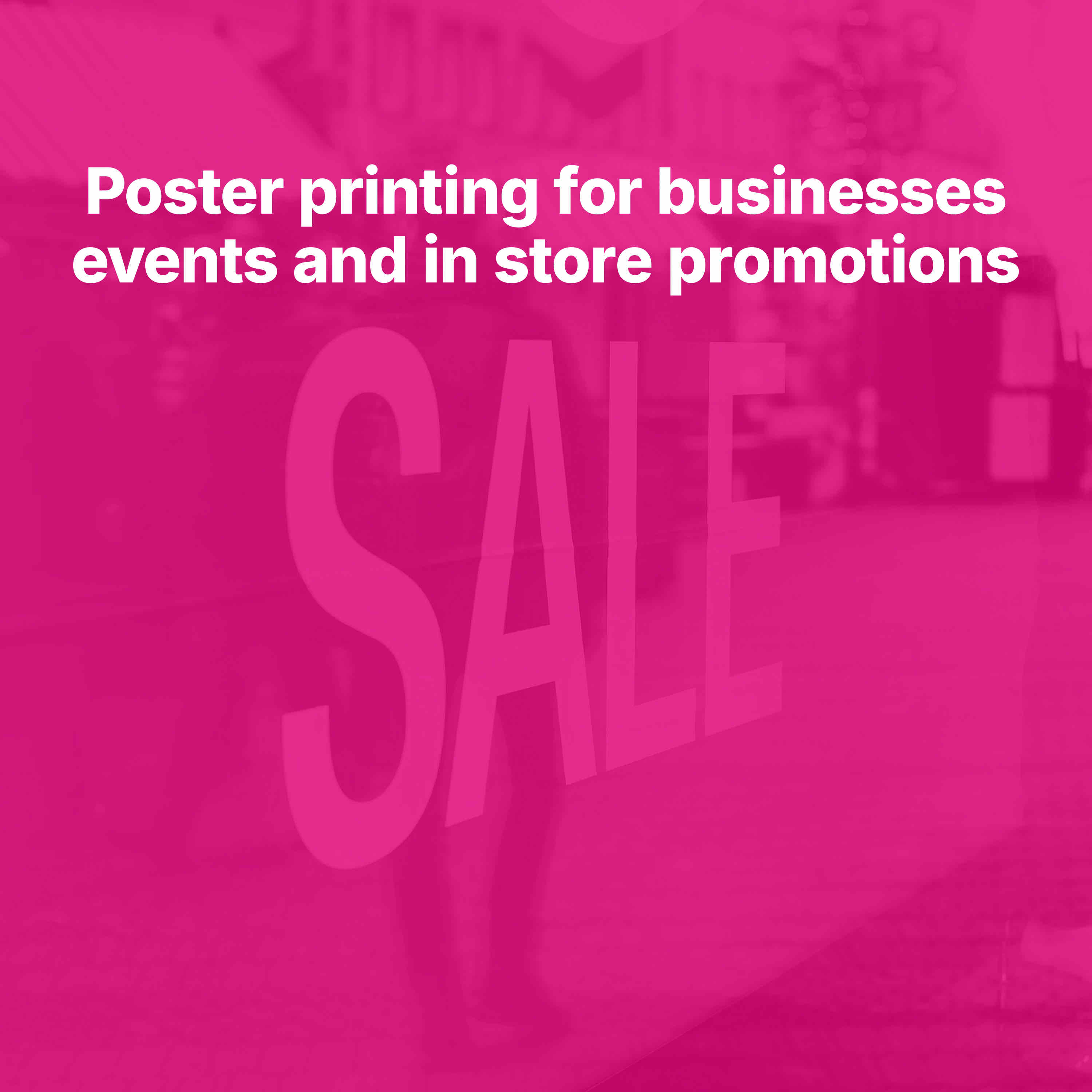
Promotional Posters Need to Be Immediate
Promotional posters usually perform in places where people have little time to decide whether the message matters. That may be a storefront window, retail counter, restaurant wall, hallway display, or community board.
In those settings, immediacy matters.
A promotional poster should tell viewers what is happening fast. Whether the message is a sale, special event, opening, seasonal campaign, or limited offer, the poster needs a simple answer to the question: why should I pay attention?
That is why shorter headlines and clean layouts often outperform dense text. A poster that looks easy to understand tends to earn more attention than one that feels like work.
Public Event Posters Need to Balance Information and Accessibility
Public events often involve broader audiences than business promotions or ticketed entertainment.
A poster for a school event, city program, neighborhood festival, fundraiser, or civic gathering may need to feel more inclusive and easy to navigate. It still needs visual appeal, but it also needs to communicate information with less friction.
That usually means:
- a welcoming tone
- an obvious event name
- date and location details that are easy to spot
- a layout that avoids overcrowding
- a design style appropriate to the community and type of event
In public event marketing, effectiveness often comes from reducing confusion rather than increasing visual complexity.
Readability Is Often the Difference Between Seen and Ignored
A poster can have a strong concept and still fail if the text does not read well at the intended distance.
Common readability issues include:
- type that is too small
- weak contrast between text and background
- decorative fonts used where clarity matters more
- crowded spacing
- too many elements competing for attention
Poster design usually improves when the content is edited down and given room. White space, clear separation between information layers, and stronger type choices often do more for effectiveness than adding more graphics.
Placement Affects Poster Performance
Posters are shaped by where they live.
A poster in a storefront window may need stronger contrast because of glare. A poster on a public board may need a tighter, more immediate structure because it competes with many other notices. A poster inside an event space may have room for slightly more detail because the audience is already engaged.
That is why placement should guide the design.
Questions worth asking include:
- Will people see the poster from across the room or a few feet away?
- Will it compete with other posters?
- How much time will viewers realistically have?
- Is the environment bright, dim, busy, or quiet?
These details often determine whether a design idea will actually work once printed. For outdoor events, heavy-duty banner printing may also be worth considering alongside posters.
Effective Posters Feel Specific to the Event
Generic posters tend to blur together.
The posters people remember usually feel connected to the actual occasion. That does not require overly complex design. It means the visual choices, message, and tone should reflect the event itself.
A public concert should not look like a retail sale. A community fundraiser should not feel like a nightclub flyer. A seasonal promotion should not use the same layout logic as a formal civic announcement.
This is where custom design becomes especially useful. Print Fellas gives customers access to real designers who can customize the design to fit the customer’s event, brand, and message. That support helps posters feel more relevant, more polished, and better suited to the audience they are trying to reach.
Branding Should Support the Message
A strong event poster should feel connected to the business, organizer, or sponsor behind it, but branding should not overpower the information people need first.
Good branding in poster design often means:
- a recognizable logo treatment
- brand colors used with restraint
- a tone consistent with the organizer's identity
- a layout that keeps the event message central
When branding is handled well, the poster feels credible and cohesive without losing clarity.
Calls to Action Help Turn Attention Into Next Steps
An event poster may not close the whole decision on its own, but it should make the next step easy for interested viewers.
Depending on the use case, that next step might be:
- view the gallery for poster ideas
- request a quote for custom posters or event print packages
- upload artwork for production
- browse product pages for posters, banners, or related event signage
These internal calls to action are especially helpful for organizers, promoters, and businesses that are planning additional print materials beyond a single poster.
Better Posters Usually Come From Better Editing
One of the most reliable ways to improve an event poster is to remove what the poster does not need.
That may mean shortening the headline, moving nonessential information elsewhere, simplifying the image treatment, or reducing the number of emphasized elements. Good poster design often feels stronger because it is more selective.
That selectivity is easier when a real designer helps shape the hierarchy and decide what belongs in the layout.
What Makes an Event Poster Effective in the End
Across promotions, concerts, and public events, effective posters tend to share a few consistent traits.
They are clear before they are clever.
They are readable in the place where they will actually be displayed.
They reflect the tone of the event without losing focus.
They guide the viewer toward the most important information first.
And when needed, they make the next step easy.
If you are planning event posters, it helps to browse the Print Fellas gallery, request a quote for a custom poster project, or upload artwork if your concept is already prepared. Product pages for posters and related banner signage can also help determine the right print mix for the campaign.
The most effective posters are not the ones that simply fill space with information. They are the ones that make people stop, understand, and remember what matters.